


Dope Bakehouse
Project Scope
Creative Direction, Strategy, Design
Category
Food & Beverage
Credits
Direction/Design - Ryan Davis
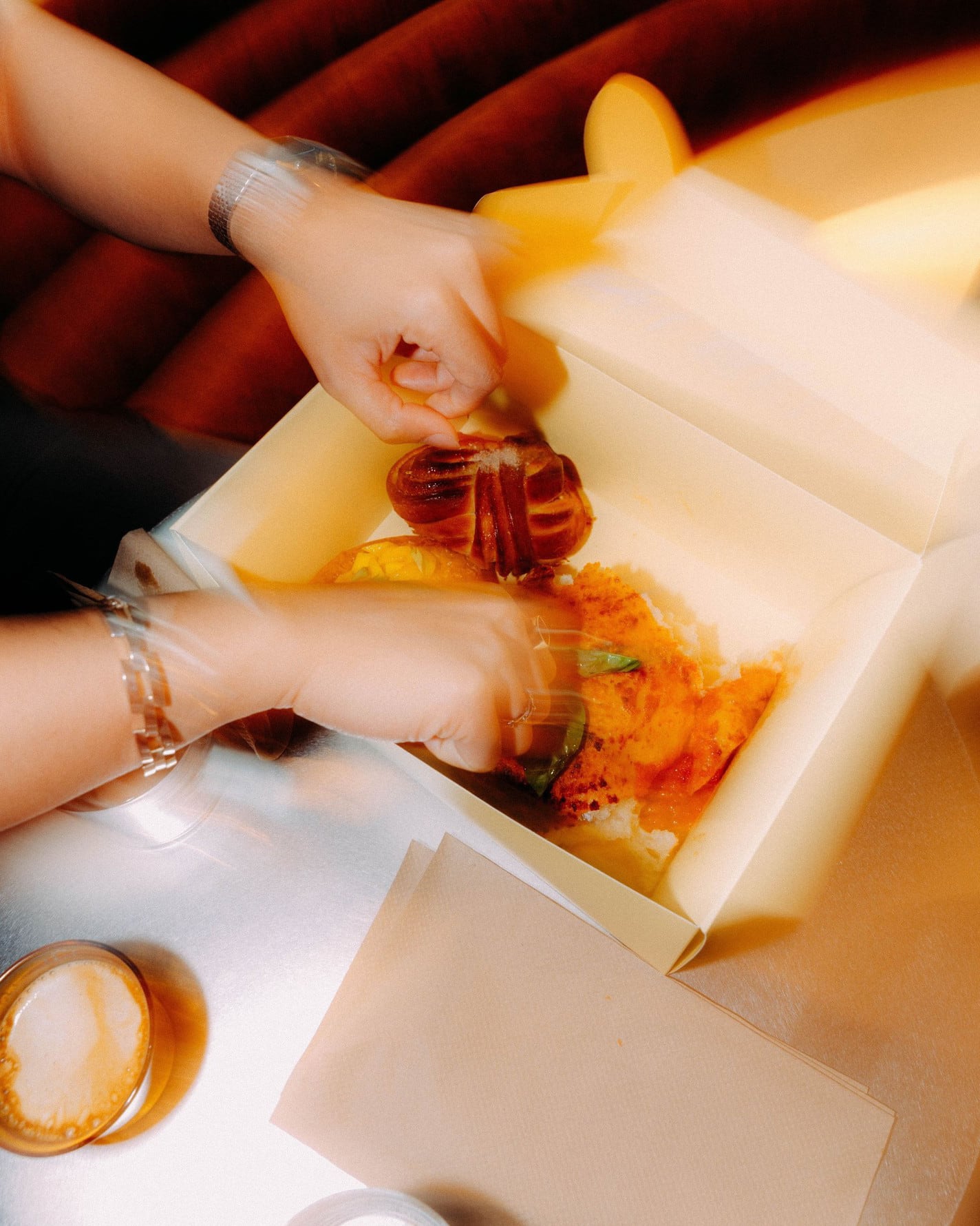
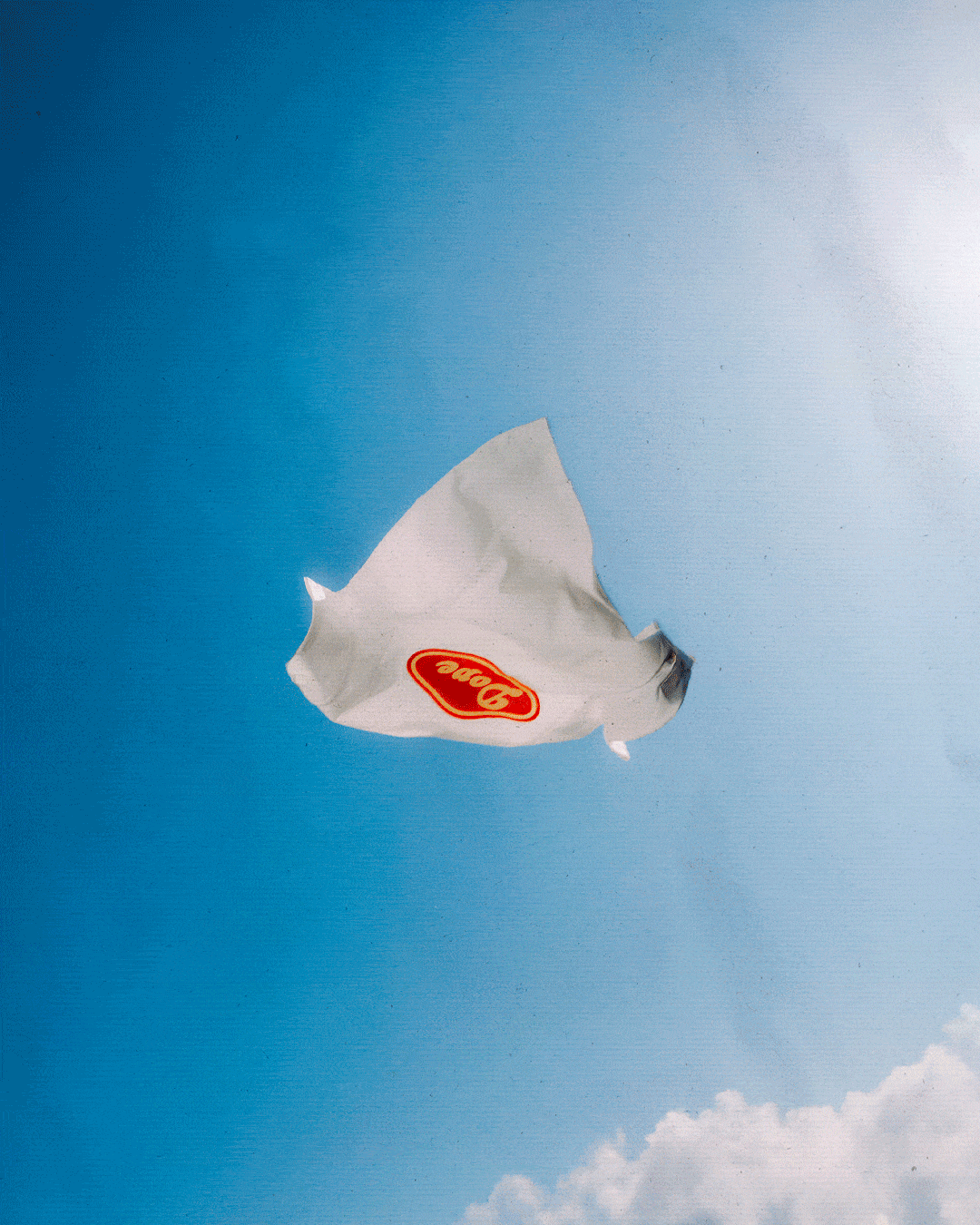
Videography/Photography - Danny Astefan
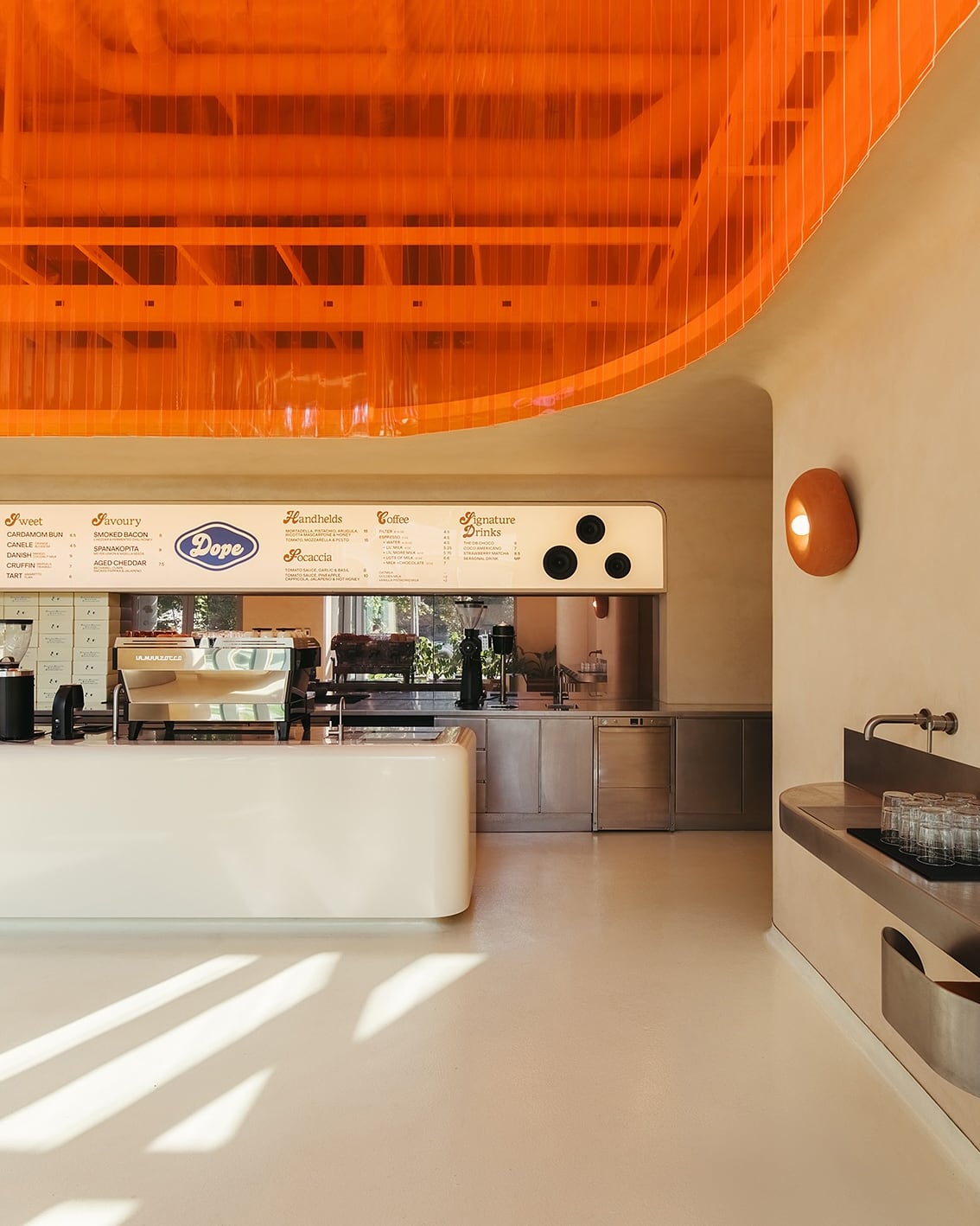
Interior Photography - Juno Kim
Interior Design/Build - Sml. Studio
Year
2024/2025
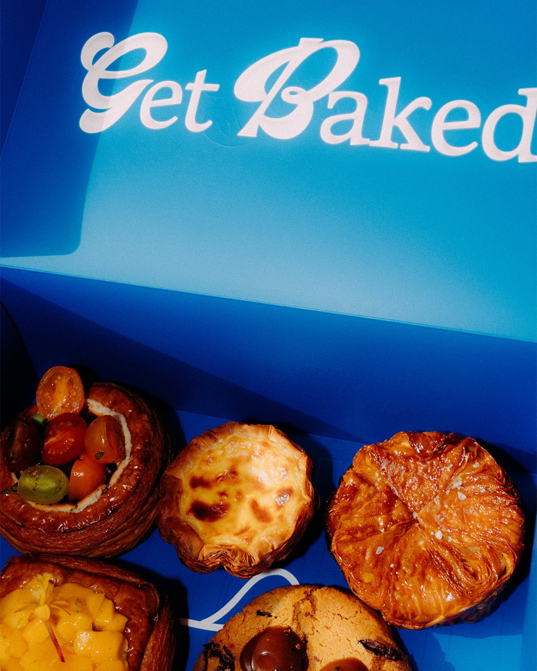
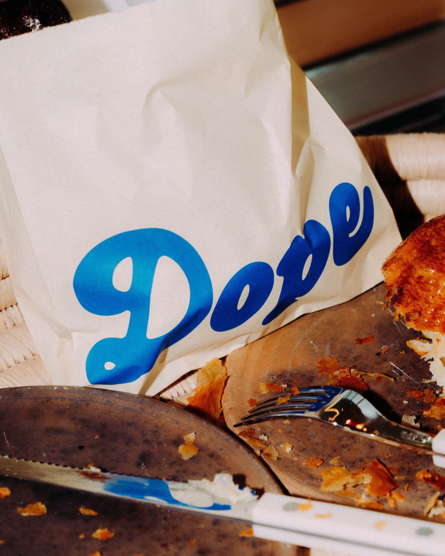
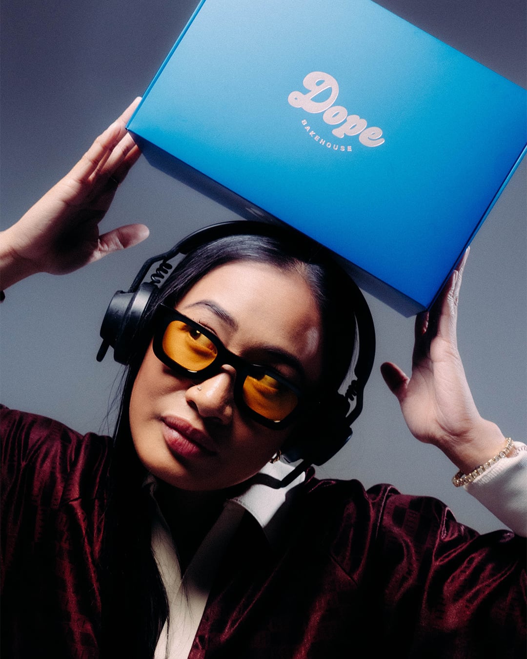
Getting to the heart of what the founders wanted Dope Bakehouse to be, we imagined the brand as the younger, whimsical and wild brother of Nemesis Coffee.
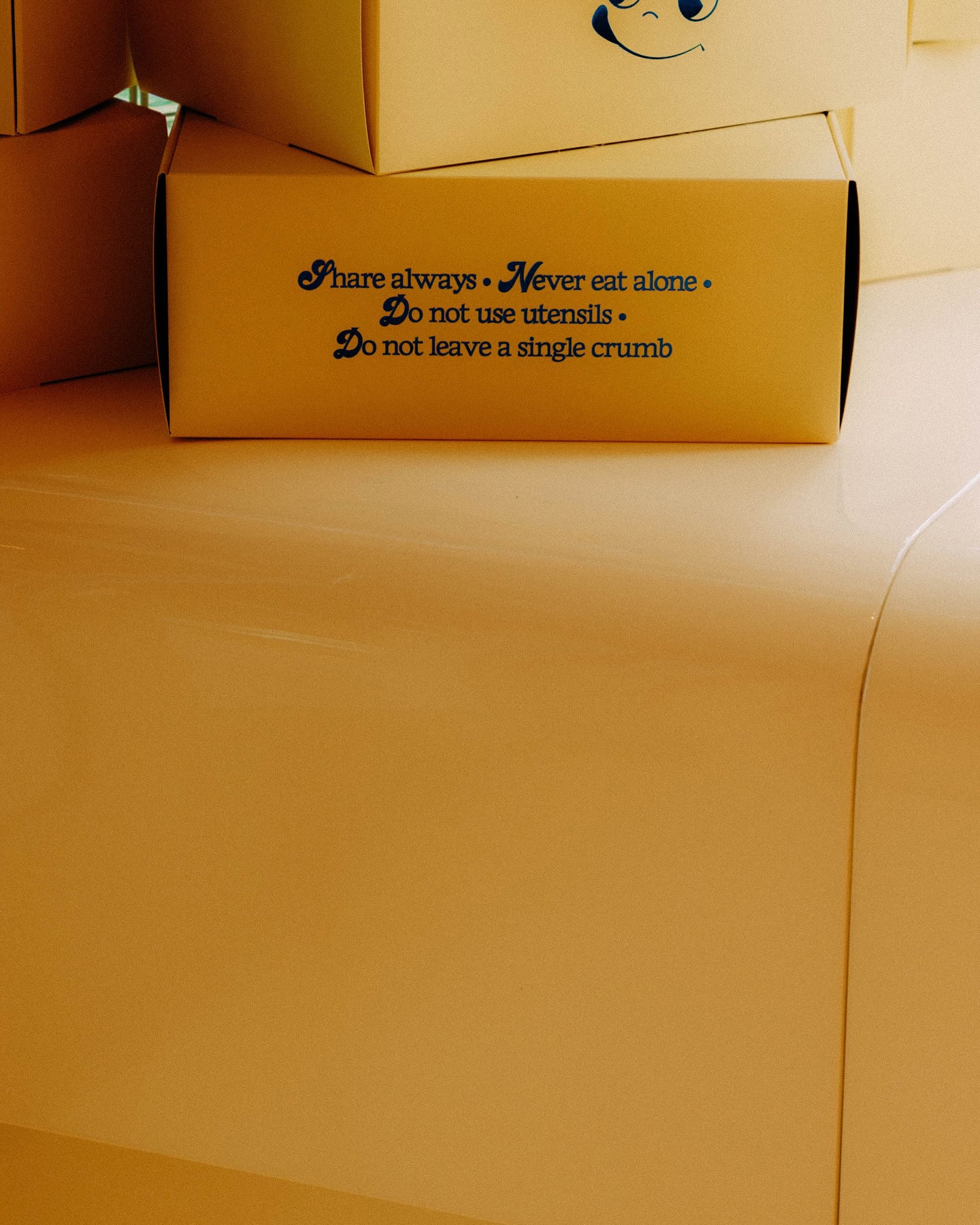
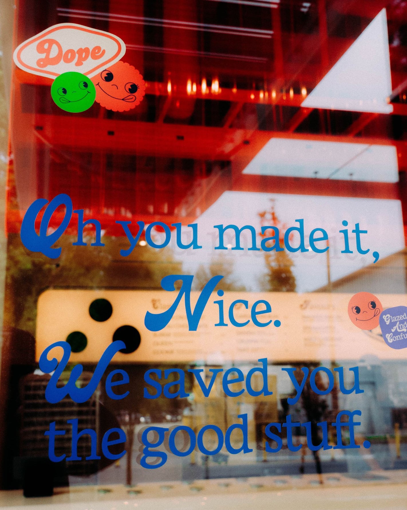
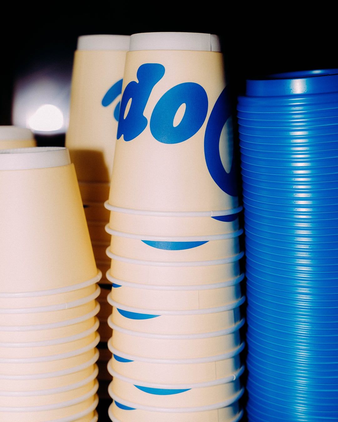
More tongue-in-cheek and unexpected than their established coffee shop Nemesis, Dope’s brand direction is a fresh take on nostalgic elements; 1960’s Japanese cartoons and script typography. There is a considered hand done touch without taking itself too seriously. Stickers with facial expressions show patrons enjoying pastries, graphic elements with soft edged shapes are inspired by the interior build, and the badge logo is a nod to logo flips in streetwear.
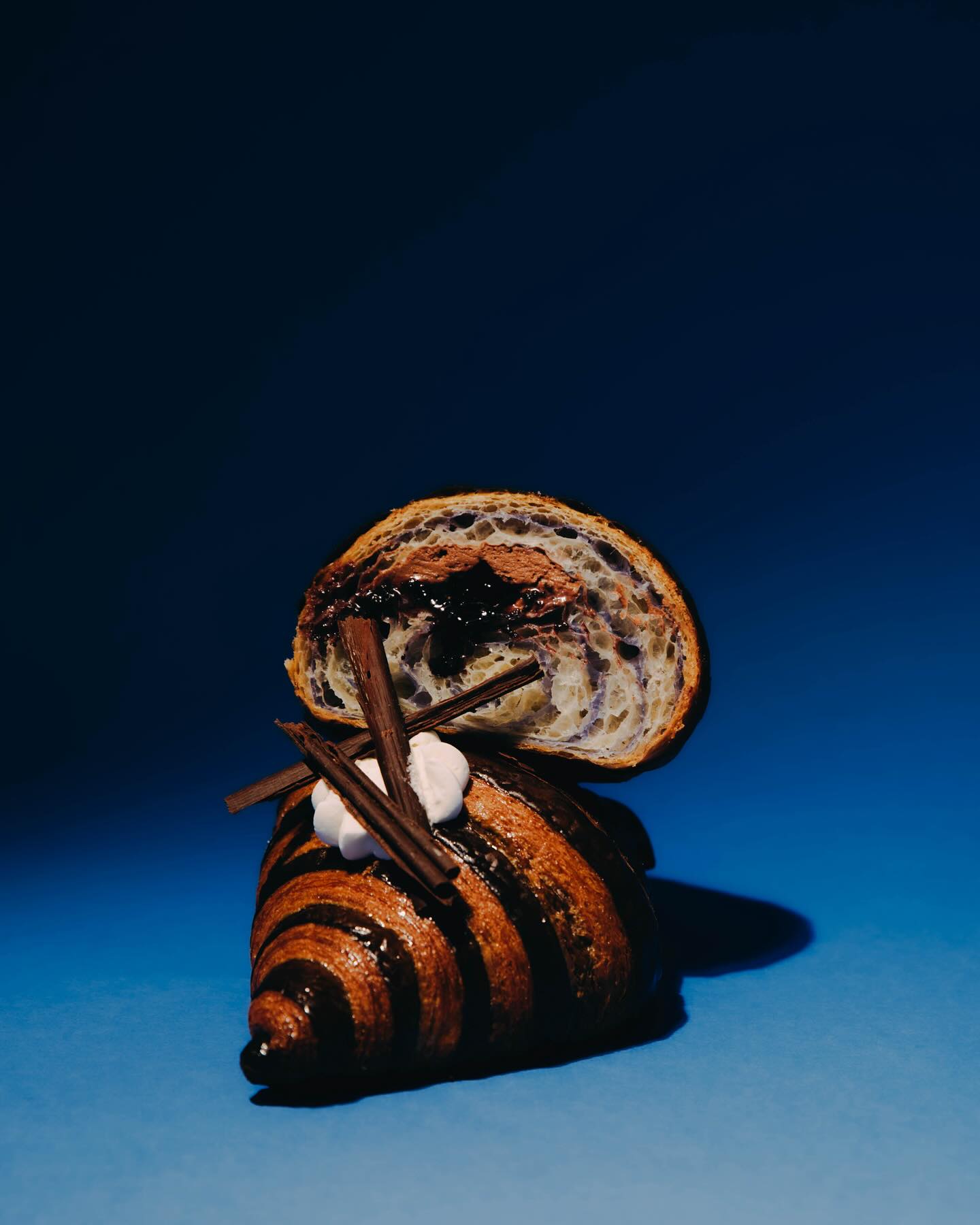
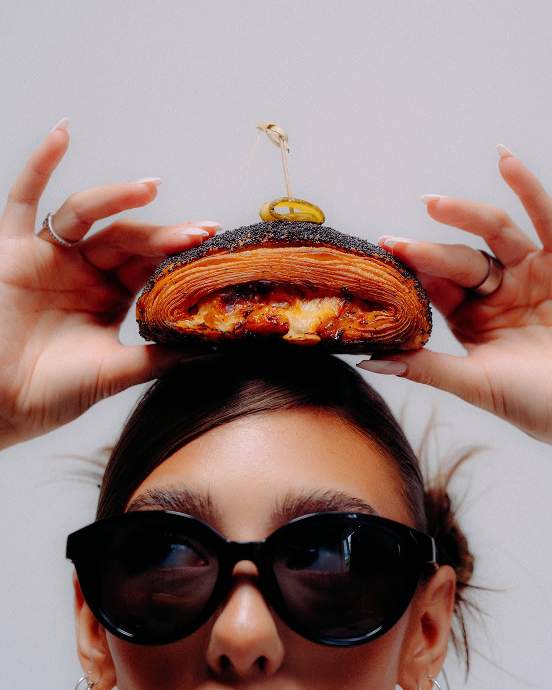
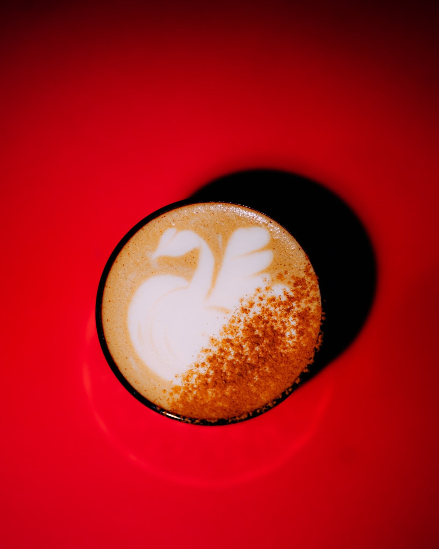
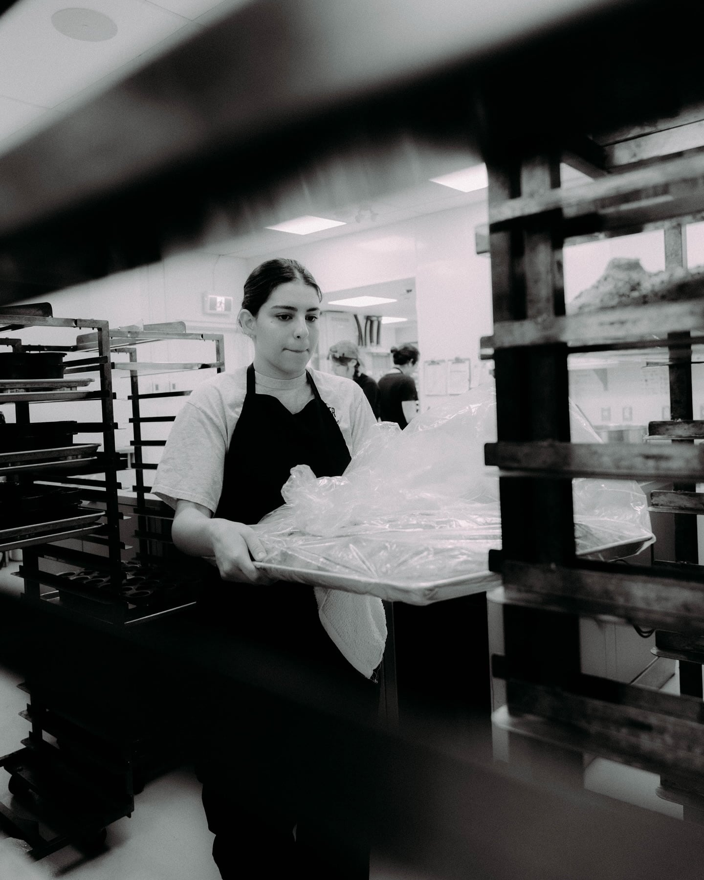
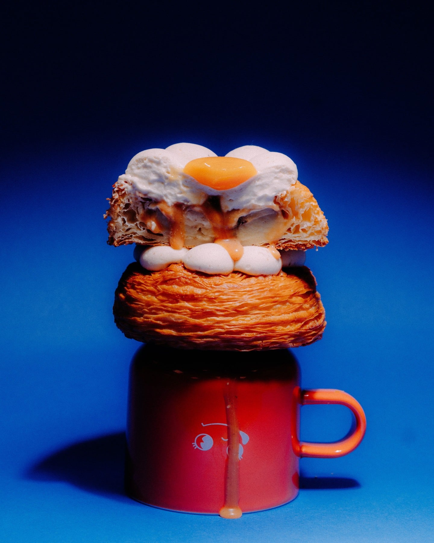
A sense of humour and playfulness is also added for good measure, seen in brand slogans such as “Glazed and Confused” and “Stop & Smell the Flour”. To wrap it up, the photography is a fun mix of raw and candid, versus clean and polished studio shots of Dope’s baked goods.